Are you looking for an easy way to increase your website conversion rate? With optimized landing pages, you can remove unnecessary distractions and focus your visitor’s attention on taking action.
This article will show you how to create landing pages that convert with our expert tips and tricks. As a result, you’ll have a fool-proof way to turn visitors into qualified leads and sales.
- 1. Define What You Want to Accomplish
- 2. Plan Essential Landing Page Elements
- 3. Choose the Best Landing Page Builder
- 4. Keep Your Landing Page Simple
- 5. Display Powerful Social Proof
- 6. Use Video for Your Sales Pitch
- 7. Create Urgency With a Countdown Timer
- 8. Recover Abandoning Visitors With Exit Intent
- 9. Remove Page Navigation
- 10. Add a Sales Notification Popup
- 11. Use Trust Elements
- 12. Keep Your Forms Short
- 13. Improve Your Landing Page Load Speed
- 14. Integrate Your Landing Page with Social Media
- 15. Use Clear Typography
- 16. Use a 2-Step Optin to Boost Sales
- 17. Make Your Landing Page Mobile First
- 18. Experiment With Landing Page Colors
- 19. Utilize White Space
- 20. Never Stop Testing and Tweaking
What is a Landing Page?
The purpose of a landing page is to remove distractions and motivate visitors to take action. It could be to sign up for your email newsletter, buy a product or service, or even download a freebie.
Regardless of your offering, your aim is to encourage users to take essential steps that lead to a conversion. And in return, you’ll give them something of value that they want.
You might be thinking, “isn’t’ a landing page, just another homepage?” While they may look similar, there are some key differences between a homepage and a landing page.
Homepage vs. Landing Page
A website homepage is usually the first page visitors see when directly accessing your site. Homepages are often found via word-of-mouth recommendations and links in your social media profiles. They’re designed to provide users with a range of information so they can pick and choose what to explore.
On the other hand, a landing page is most often found through organic search results. They’re designed to target specific keywords to attract a particular audience. Their job is to then convince and persuade visitors to make a single decision and act, with the ultimate goal of converting them into a lead or customer.
As you can see, landing pages are designed around a specific purpose to help you increase conversions for your business.
20 Tips for Creating High Converting Landing Pages
Now that you know the purpose of a landing page, keep reading to discover how to create one optimized for conversions. We’ve put together various tips, tried and tested by expert marketers so that you can create landing pages that convert from day 1.
1. Define What You Want to Accomplish
Before creating your landing page, you need to put together a plan covering all aspects of what you want to accomplish. This will help you target your page to the right audience and get better results.
First, decide why you want to build a landing page and what you’ll offer in return for users giving you their details. It could be to…
- Promote a new product or service
- Offer a free download to grow your list
- Increase registrations for a webinar or event
- Encourage product pre-orders
- Get direct users to your social media profiles
Then you need to plan your message. How will signing up for your email list solve the user’s problem? How will downloading your free eBook change the reader’s life?
This is where persuasive landing page copy is useful because it’ll help you paint a picture of the outcome of buying your product.
For example, you’re not buying anti-wrinkle cream; you’re buying smooth, youthful-looking skin. The cream is just the way to get there. So essentially, you’re really selling an outcome while the product is only the means of getting there.
The next step is to search for keywords relevant to your topic. These are terms and phrases your target audience is using to look for a solution to their problems. And it’s those phrases that will lead them to your landing page.
To help you get started, here’s a complete guide to choosing the right keywords for SEO.
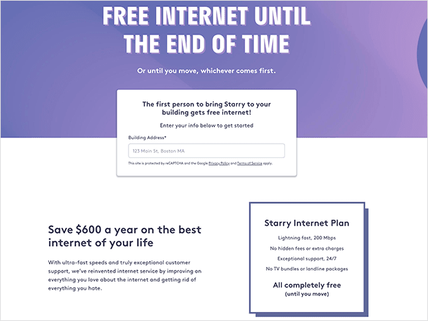
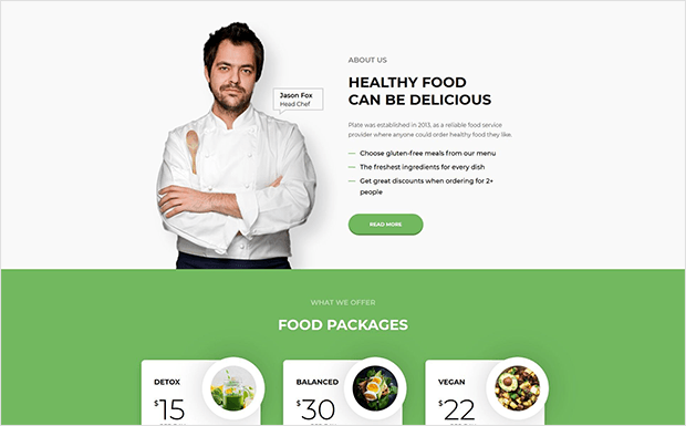
2. Plan Essential Landing Page Elements
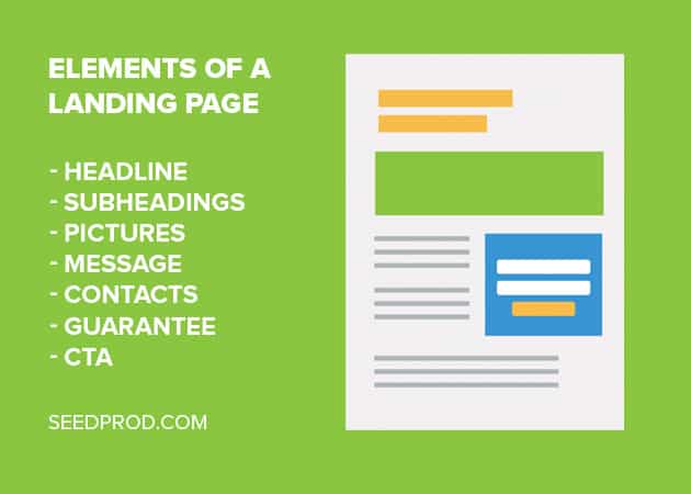
After planning the goal, message, and keywords for your landing page, it’s time to start thinking about the different elements you’ll use to lead the reader to take action.
Here are some essential design elements every landing page should have:
- Headline – This is the first thing users will see, so it should clearly state what the users will get from your page.
- Subheadings – Use subheadings to support the statement in your headline and draw the reader’s eye down the page and keep them engaged.
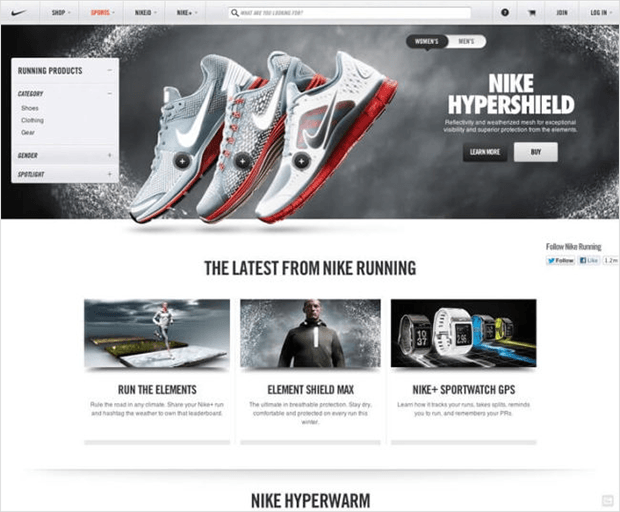
- Pictures – Our brains process images faster than text, so pictures are a must-have. Keep your landing page pictures relevant to your product, eye-catching, and high-quality.
- Pain Points – As we mentioned earlier, you need to speak to your reader’s fears so you can offer a solution. Illustrate a pain point your reader might be experiencing, then explain how your product or service provides the answer to that pain.
- Contact Methods – To show that your company is legit, provide a way for readers to get in touch with questions and concerns. For this, you could use a simple contact form or offer a live chat service.
- Guarantee – No matter what type of guarantee you offer, it helps people feel safe and reassured. Choose a guarantee relevant to your business and position it close to your call to action (CTA).
- CTA – Your CTA is the most powerful element on your page. Choose a big button in a contrasting color to draw attention and use persuasive copy to spur readers into action.
3. Choose the Best Landing Page Builder
To create your landing page, you’ll need to choose a landing page builder that suits your business needs, goals, and skill level.
If you’re just starting and have little technical knowledge, it’s best to use a landing page builder with pre-made landing page templates. This will make it easier to design an effective page.
It’s also worth looking for a page builder that includes drag and drop editing so you can place elements on your page without writing any code. A/B testing is another must-have feature so you can experiment with the effectiveness of different elements.
4. Keep Your Landing Page Simple
Some businesses make the mistake of packing their landing page with as much information as possible. While this may get tons of products in front of visitors, it creates an overwhelming and confusing user-experience.
Instead of showing users everything, keep your landing page simple, clutter-free, and focused on a single offer.
By removing the unnecessary fluff, you focus people’s attention on how you can solve their problems. This makes it easier for them to navigate your page and convert.
5. Display Powerful Social Proof
Recommendations and endorsements by trusted peers play a huge role in purchase decisions. Showing potential customers that you have an active fan base goes a long way in helping you win them over.

You can do this by displaying testimonials on your landing page from users most relevant to your target audience. Try to include a picture of the customer in question to improve trust, and if real data backs the testimonials, they’ll be much more compelling.
This is the perfect place to use user-generated content (UGC) on your landing page. Authentic testimonials and photos from real reviewers make them seem more relatable to readers.
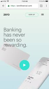
6. Use Video for Your Sales Pitch
Videos have fast become the top way that users consume information online. And YouTube is the second most popular search engine next to Google.
With this in mind, using video on your landing page is an excellent way to capture visitor’s attention while increasing the chances of your page being found on YouTube.
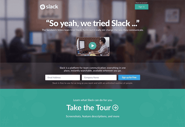
Your video doesn’t have to be long and in-depth. The best performing videos are between 30 seconds and 2 minutes long, which is long enough to get your readers’ attention and short enough that they won’t lose interest.
The video should get people’s attention right away, describe your message clearly and in a logical order, and include similar elements to your landing page, finishing with a guarantee and powerful CTA.
7. Create Urgency With a Countdown Timer
Countdown timers instill visitors with a sense of urgency that motivates them to take action. If they don’t act now, they could miss out on your awesome offer.
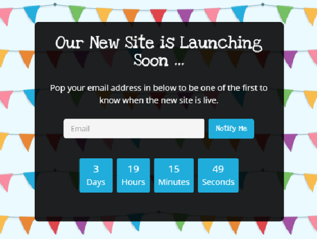
You can add a countdown timer to your landing page to limit the time that a promotion is available. This is called FOMO, the fear of missing out, and it solves potential customers taking too long thinking about an offer and changing their minds.
Instead, their time for considering your campaign is limited, so they’ll have to take action now or miss out.
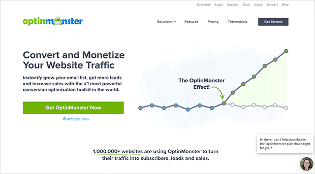
8. Recover Abandoning Visitors With Exit Intent
Another way to help your landing page convert more is to recover visitors when they’re about to leave. That way, you can redirect their attention back to your offer with an even more convincing message to convert them.
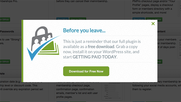
You can do this by adding an exit-intent popup to your landing page with OptinMonster.
OptinMonster is the most powerful lead generation software for marketers. And Exit-Intent Technology lets you track when users are about to leave your page and show them a tailored message in a beautiful lightbox popup.
It comes with tons of professionally designed templates for building your campaigns with ease. The drag and drop builder makes it easy to customize any element without having any technical knowledge.
Check out these exit popup hacks for inspiration on how best to use them on your landing page.
9. Remove Page Navigation

Landing pages that succeed in converting visitors, have all their elements on one page, and remove elements like navigation links from the equation.
If your landing page is littered with links that take users away from your page, you could lose them altogether. So it’s best to remove that option and give people a simple, logical layout that leads to signing up for your offer.
10. Add a Sales Notification Popup
Sales notification popups are a great way to boost sales and build brand trust with social proof. And as we mentioned earlier, a well-designed popup can add many benefits to your landing page.

With a sales notification popup from tools like TrustPulse, we’re talking about a small unobtrusive popup at your screen’s bottom. The popup usually notifies readers that someone has just bought a product or service.
Instead of being an aggressive marketing tactic, sales notification popups show social proof to help users decide to take action on your landing page.
11. Use Trust Elements
Another way to improve your landing page’s trust is to include trust indicators like statistics, authority badges, and third-party seals.
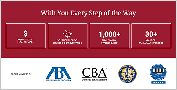
Trust elements give your brand more credibility and show that your site is safe to use. Indicators like this are reassuring for customers concerned about their online security because it shows you take their worries seriously.
And ultimately, more trust, translates into landing pages that convert.
12. Keep Your Forms Short
Your landing page lead capture forms are how you’ll collect users’ information when they take action. However, forms only work well when they’re designed properly.
If your form is too long, users will lose interest and abandon your landing page. And if it’s too complicated or asks for too much information, that can put them off too.
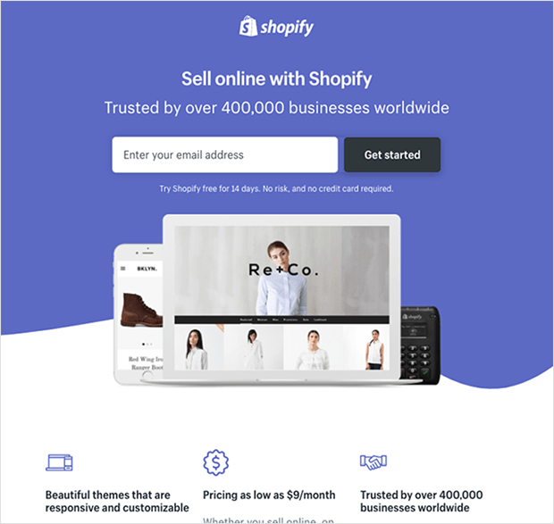
You can solve this by keeping your forms short and only asking for the information you need. The form should also be properly organized, so it’s clear what you want users to do.
Lastly, you should place the form in a strategic place on your page where it’s easy for users to notice and act.
13. Improve Your Landing Page Load Speed
Did you know that it takes users a mere 3 seconds to decide to stay or leave your landing page?
If they can’t see the content they’re looking for because the page won’t even load, they’ll leave and probably won’t ever return.
To stop that from happening, and for landing pages that convert, you can:
- Ensure your landing page has a minimum amount of heavy page elements.
- Analyze the loading time of your page with a website speed test tool and make changes to improve it.
- Compress images before uploading them to your landing page.

You can also look at these tips to improve your website speed for more ideas.
14. Integrate Your Landing Page with Social Media
In a world that seems to thrive on social media, it’s easy to agree that having a social media presence is a pretty good idea for all brands.
With that in mind, integrating social media on your landing page is an effective way to empower your business and give it some vital credibility.

Landing page builders like SeedProd include easy social media integration to add social profile buttons to direct users to your social networks. They also include social share buttons to increase brand awareness on Facebook, Twitter, YouTube, Pinterest, etc.
15. Use Clear Typography
Some fonts are easy to read, while others are more decorative and harder to make out, making your reading experience frustrating.
Since your landing page is designed to provide clear information, your typography should be straightforward too. If your font is frustrating to read, users won’t spend more than a few seconds trying to learn about your offer and won’t convert.
A good rule of thumb is to choose commonly used font pairings like:
- Verdana, Geneva, sans-serif
- Georgia, Times New Roman, Times, serif
- Courier New, Courier, monospace
- Arial, Helvetica, sans-serif
- Tahoma, Geneva, sans-serif
- Trebuchet MS, Arial, Helvetica, sans-serif
- Arial Black, Gadget, sans-serif
- Times New Roman, Times, serif
You can find many of these for free on Google Web Fonts, so you can experiment with different combinations before adding them to your landing page.
It’s also essential to make sure your CTA button typography is clear and easy to read. This is the one landing page element you really need people to notice.
16. Use a 2-Step Optin to Boost Sales
As discussed earlier, your landing page will likely include either a CTA button or optin form to gather leads.
The best option for building landing pages that convert is, without a doubt, a CTA button because it’s off-putting to land on a page and get hit with a form instantly. The drawback of only showing a CTA button is that it’ll redirect users to another page, introducing friction to the user experience.
A good way around that is to use a 2-step optin, which lets you show a CTA button, which, when clicked, reveals your optin form, without sending users to a different page.
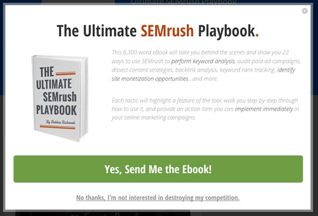
The advantage of this is you can build your landing page without asking for contact or payment information. Then users can view the content on your page without feeling pressured to sign up.
Even better, when users make that first click on your CTA button, they’re more likely to finish opting in because they’ve already started the process.
17. Make Your Landing Page Mobile First
If your website isn’t mobile-first, you’re already falling behind on current trends. But going mobile-first isn’t just limited to your website; it extends to your full online presence, including landing pages.
Make sure you test your landing pages on various mobile devices to ensure it displays well and functions in the same way as the desktop version.
You should also avoid placing distracting elements as the user scrolls. Instead, focus on powerful headlines, convincing images, and a call to action that instantly grabs attention.
18. Experiment With Landing Page Colors
Color has a crucial impact on how users interpret your landing page. This is usually based on their expectations based on real-world experiences and their psychological response to different colors.
For example, the color “green” is often associated with “go” thanks to traffic lights, but it’s also closely linked to nature. So if you’re selling natural or organic products, or want users to “go” to your CTA, green might be the best color to choose.
When you’re picking colors for your landing page, think about the kind of products you’re selling and which colors best represent them.
You should also explore the emotions different colors evoke and your audience’s age range because other age groups will likely respond differently to certain colors.
19. Utilize White Space
It’s tempting to fill your landing page with as much color and interest as possible. But while leaving white space on your page might seem to look boring, it can actually play a crucial role in securing conversions.

White space is the opposite of information overload. It has no distractions, so it gives users the room needed to focus on your message and really let the benefits sink in.
As they scroll down your page, there’s nothing aside from the user and your message. And when they get to the end, they’re hit instantly with the call to take action now, making it more likely they’ll sign up.
20. Never Stop Testing and Tweaking
Something you’ll learn as you go through the process of building your landing page is there isn’t a single recipe for conversions. You can read all the tips in the world, but nothing will beat experimenting to see what works for your specific business and audience.
The best landing page plugins will offer tools to help you test different page elements, so use those tools often.
You can also use MonsterInsights, the best Google Analytics plugin for WordPress, to track your landing page’s activity and its visitors. Then you can tailor your message to those people in an effort to increase conversions.
Bottom line: the more you test and experiment with your landing page, the better idea you’ll have of what works best.
There you have it!
We hope this article helped you learn how to create landing pages that convert. With these expert tips, you’re well on the way to increasing conversions, leads, and sales so you can successfully grow your business.
While you’re here, you can follow these steps to create a simple landing page in WordPress.
And if you liked this article, do follow us on Twitter and Facebook for similar content.
The post How to Create Landing Pages That Convert (20 Expert Tips) appeared first on SeedProd.


