Are you looking for some great landing page examples to inspire your next design?
Using landing pages on your small business website is the best way to improve your conversion rates and turn website visitors into subscribers and customers. That said, it’s hard knowing where to start with your landing page design.
So, in this article, we’ll share our top landing page examples from real companies and explain how they boost lead generation and increase conversions.
- 1. Netflix – Signup Landing Page Example
- 2. Zoom – Industry Report Landing Page
- 3. Constant Contact – Free PDF Landing Page
- 4. Lyft – Driver Application Landing Page
- 5. OptinMonster – Sales Landing Page
- 6. Dadz – Google Ads Landing Page
- 7. Codecademy – Membership Signup Page
- 8. Airbnb – Signup Landing Page Example
- 9. Asana – Product Manager Landing Page
- 10. SEMRush – Webinar Registration Landing Page
- 11. Dropbox – App Landing Page Example
- 12. Smash Balloon – Black Friday Landing Page Example
- 13. Dreamforce – Event Registration Landing Page
- 14. Digital Marketer – Training Landing Page Example
- 15. Taboola – Free Ebook Landing Page
First, let’s explore the purpose of a landing page and how it works.
What Is a Landing Page and How Does It Work?
A landing page is a standalone website page with a single goal in mind – to generate leads.
Many landing pages offer potential customers a resource such as:
- An eBook
- Webinar registration
- Special offer
- Free course
And in return, they ask for basic information like a users’ email address and phone number.
Instead of serving a standard advertisement showing users a product or service, landing pages are designed to engage and excite customers by offering a resource related to the product or industry.
After filling in the landing page form and claiming the reward, users are more likely to trust that brand and become a paying customer.
To give you an example, if a company wants to sell an automation tool to help business owners automate their marketing efforts, they might create a landing page that offers audiences a free video on using marketing automation for small businesses. We’d call this a video landing page.
Interested users might offer their contact details in return for that valuable information. Then, if they enjoy the video, they may be more likely to purchase a product from that brand.
You can create all kinds of landing pages to serve different goals, including:
- 404 landing pages
- Thank you page
- Squeeze landing pages
- Sales pages
- Coming Soon pages
- Maintenance Mode landing pages

Now that you know the purpose of a landing page, what elements should you include to get the results you need?
What Should Be Included in a Landing Page?
The most successful landing pages include the following elements to drive leads and conversion rates:
- Headlines: An attention-grabbing statement that gets peoples’ attention instantly.
- Sub-headings: Describe the key talking points and draw the eye down the rest of the page.
- Compelling Copy: Describe what is being offered on the page. Use lists and bullet points to make this information easier to skim read.
- Media: Use video and images to visually explain your offer and make complex information easier to understand.
- Proof: Include supporting elements such as reviews, testimonials, and social proof to increase trust and authenticity.
- Call to Action: Include several CTA buttons in contrasting colors to get users to take action.
- Signup Form: Include a signup form, registration form, or contact form (based on your needs) to collect leads easily.
15 Examples of Landing Pages That Convert
Now that you know how a successful landing page works and essential page elements to include, let’s explore some of the best landing page examples from real companies.
1. Netflix – Signup Landing Page Example
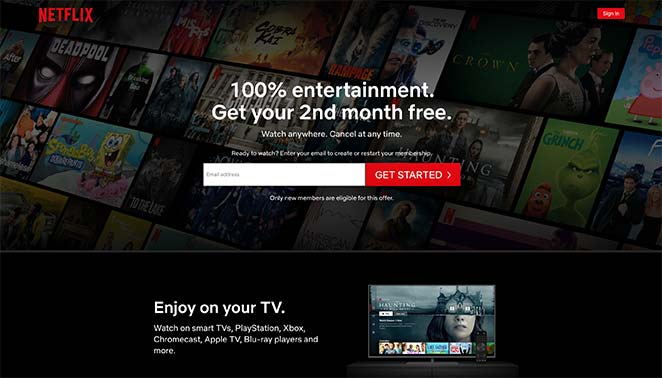
One of the best examples of landing pages that convert well is this sign up page from Netflix.
On entering the page, you’re immediately faced with what they’re offering and the invitation to get started now. This removes the friction around making a decision, spurring people to take action quickly.
Why This Landing Page Design Works
- Headline – Benefit drive headline captures attention instantly.
- Trust – Reassurance that you can cancel any time removes any risk.
- Signup Form – It has only 1 form field, making it easier for users to sign up.
- Easy access – Essential information is at the top of the page, making it easy to access.
- Persuasive Copy – Page copy focuses on benefits rather than features, which is more persuasive.
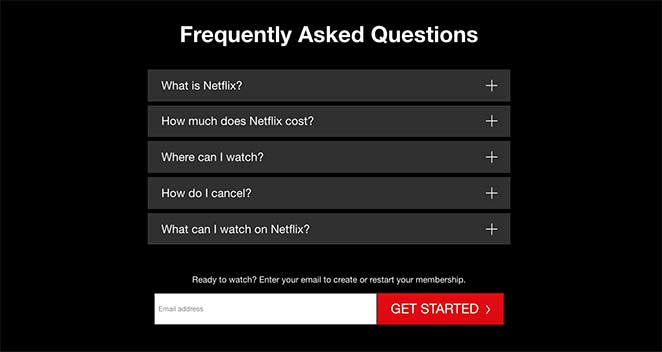
- Clarity – FAQ section removes obstacles to signing up.
- CTA – A second sign up form at the bottom of the page to remind users to signup.
2. Zoom – Industry Report Landing Page
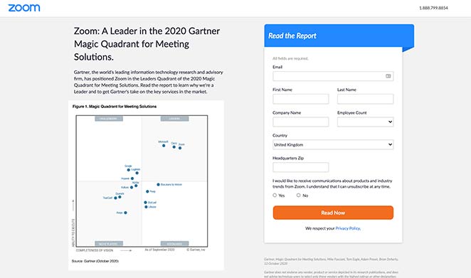
Zoom is a popular video conferencing software with customers in a variety of industries. So it makes sense they’d want to position themselves as a leader in their field of expertise to potential customers.
They’ve tried to do this by offering a free report that features the company as a leader for meeting solutions. Users can sign up to download and read the report at no cost.
Why This Landing Page Example Works
- Free Download – Offering the report for free makes the information more accessible.
- Simple Form Fields – The signup form only includes the information the company needs, which can reduce form abandonment.
- Persuasive Copy – The copy positions this report as a must-read, promising to explain why Zoom is a leader. This creates curiosity, encouraging users to sign up and download the file.
- CTA Button – The color contrast of the CTA button makes it stand out from the page, making it more clickable.
3. Constant Contact – Free PDF Landing Page
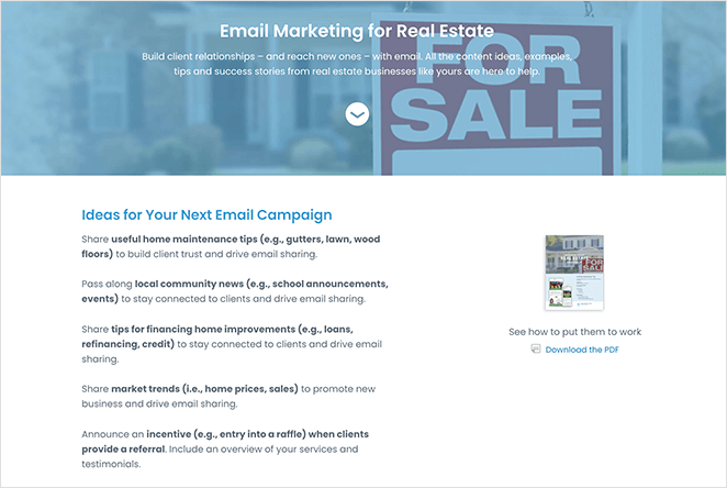
Just like Zoom, Constant Contact serves a variety of industries with their email marketing platform. However, in this landing page example, they’re specifically targeting real estate companies.
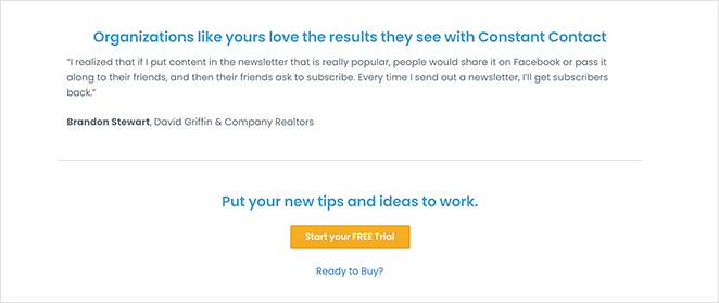
The landing page design is clean, minimal, and straight to the point. It offers a free download full of essential tips and success stories to help with real estate marketing efforts. Plus, it includes a CTA inviting users to try Constant Contact for free.
Why This Landing Page Example Works
- Powerful Headline – The headline and description clearly explain what users will get from the download.
- Persuasive Copy – The copy is to-the-point and demonstrates the benefits of reading the guide.
- Images – Users can see a preview of the PDF to get an idea of what it will include.
- Proof – Includes a client testimonial explaining how email marketing worked for other customers.
- CTA – The CTA button invites users to sign up for the free trial. Users are more likely to opt for a trial because there is no financial commitment.
4. Lyft – Driver Application Landing Page
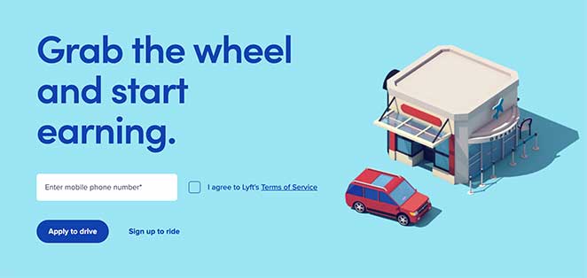
Lyf’s driver application landing page is an excellent example of how a signup page design doesn’t have to be complicated. The headline is straight-forward, telling users exactly what to do, and the signup form only asks for a mobile number, making it super-easy for users to get started.
Why This Landing Page Example Works
- Minimalist Design – There are no unnecessary distractions to take your attention away from the page goal.
- Simple Form – The signup form includes only 1 form field, increasing the chances of successful registration.
- Images – The simple image creates an emotional response in users, reaffirming why they’re taking action.
- CTA – The CTA button is highlighted with the action Lyft wants you to take. The less desired action is less noticeable.
5. OptinMonster – Sales Landing Page
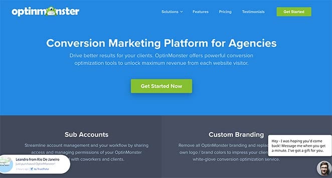
If you’re looking for a landing page design from a SaaS business, you’ll love this example from OptinMonster. Their agency solutions sales page has all the essential elements of a high converting landing page.
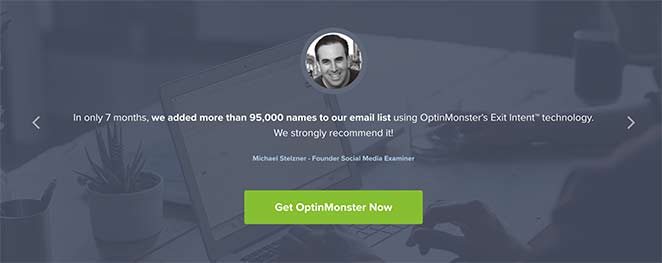
Not only are their brand colors on-point, but they also use a variety of tactics designed to maximize conversions, which we’ll explore below.
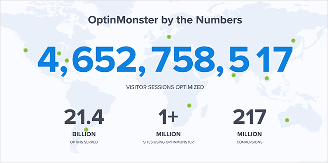
Why This Landing Page Example Works
- Page Sections – Different page sections break up the page, making it easier to find the information you’re looking for.
- Feature Benefits – The features section focuses on the benefits of using the software.
- Testimonial slider – See what real customers think about the software.
- Images: Images and gifs demonstrate exactly what the software does.
- Social Proof – This page uses a combination of recent sales notifications and a live count of how many people the software serves, which shows its popularity.
- CTA – CTA buttons are used throughout the page, offering easy ways for users to buy.
- Live Chat – With live chat, users can get their questions answered right away.
6. Dadz – Google Ads Landing Page
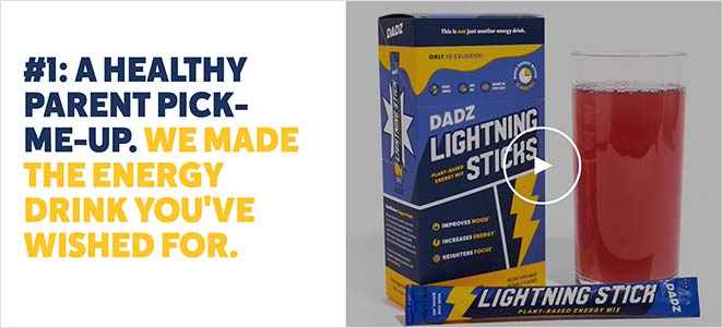
This landing page is a little different. We found it after clicking on an ad in Google search results. This is an excellent tactic used to drive specific audiences to your page, as you can tailor your messaging exactly to that audience’s needs.
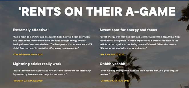
In this case, the audience is a modern family man, which the landing page serves perfectly.
Why This Landing Page Example Works
- Audience Match – This landing page matches the type of audience it targets, offering solutions relevant to their needs.
- Case Studies – You’re invited to read case studies before buying, which is a form of social proof.
- Video – Dadz includes an engaging video showing you how you feel after using their product.
- Reviews – Reviews from real customers show it’s a product worth trying.
- Social Media – The large Instagram gallery demonstrates the brands’ thriving community.
- CTA – CTA buttons are used throughout the page, offering multiple opportunities to buy.
7. Codecademy – Membership Signup Page
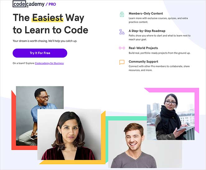
This example of a landing page from Codecademy shows that using white space throughout your design can help draw attention to crucial page elements.

Instead of filling the page with distracting imagery, gradients, and full-screen backgrounds, Codecademy has kept things simple with bold pops of color to draw the eye.
Why This Landing Page Example Works
- Use of Color – Using color in key page areas creates interest and directs the eye to where you want it to go.
- Images – The imagery on the page comprises happy, smiling professionals, which creates an emotional and positive response in users.
- Testimonials – Reviews from real customers show their genuine experience, and that the product is worth trying.
- Pricing – The price comparison makes it easy to see the best plan for you at a glance.
- CTA – The CTA section is on a contrasting background, making it stand out from the rest of the page.
8. Airbnb – Signup Landing Page Example
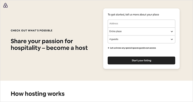
Airbnb is all about making it easy to find places to stay while giving customers a way to make money from their homes. Their host sign up landing page is another excellent example of how you can make your page content speak for itself without any unnecessary bells and whistles.
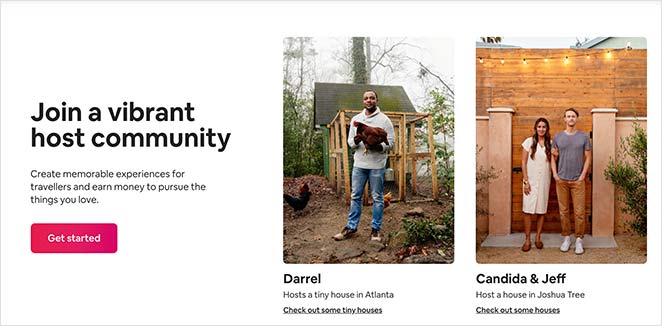
It’s simple, straightforward, and guides visitors through the process of making a decision.
Why This Landing Page Example Works
- Signup Form – The signup form only includes 3 fields, with optional fields hidden under a tab. This makes it less overwhelming while still allowing them to collect crucial information.
- Resources – The resources section provides all the information people need to know about how hosting with Airbnb works.
- Community – Potential customers can see how other people use the service, which can help them decide.
- Support – It’s easy to see the support available, removing an obstacle from signing up.
- CTA – CTA buttons are used throughout, providing multiple occasions to join.
9. Asana – Product Manager Landing Page
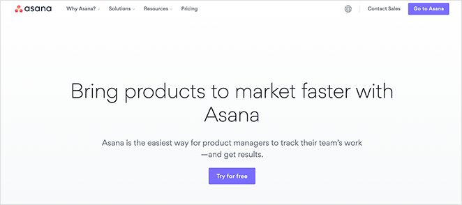
In this landing page design, Asana targets product managers, offering a product management software solution. The page is completely tailored to this audience, explaining why their product is the best choice.
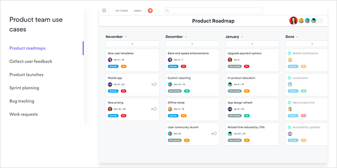
While the page might seem super simple at first glance, it’s easy to see why it works. The individual page sections break the information down into manageable chunks, directing your attention at each stage until you reach the final CTA.
Why This Landing Page Example Works
- Headings – The headlines describe all the benefits of Asana at a glance.
- Use Cases – Multiple use cases show people all the different ways they can use the product for their business.
- Video Case Study – The video case study shows how a popular brand is using Asana to achieve business success, which is much more useful than using copy.
- Free Trial – The final CTA offers a free trial, which is less scary than diving in and buying the product right away.
10. SEMRush – Webinar Registration Landing Page
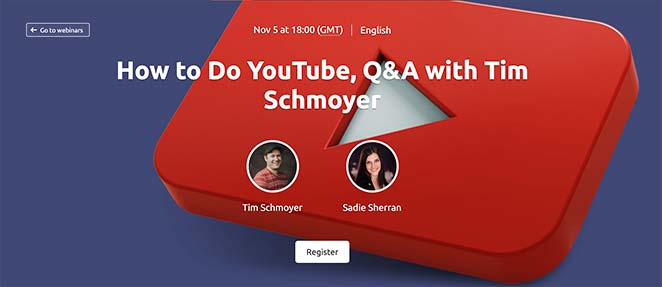
When it comes to content marketing, webinars are an excellent way to spread the word. Not only do they keep viewers engaged for longer on your website, but they’re also a great way to build relationships with potential customers.
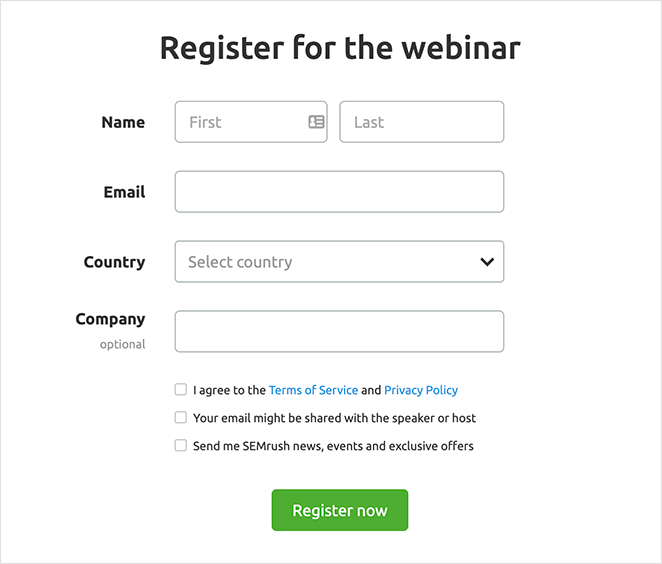
That’s why SEMRush hosts regular webinars for their audience, and their webinar registration page is a glowing example of how to promote them.
Why This Landing Page Example Works
- Hero Area – The hero area of this webinar landing page explains exactly what users will learn from watching, as well as who will be hosting.
- Clear Information – The webinar details explain who the hosts are and what you’ll learn in more detail. This creates enough interest to encourage people to register.
- Registration form – When filling in the registration form, users only need to enter a small amount of information.
- Recommended Content – Previous and future episode lists encourage users to engage with more of their content.
11. Dropbox – App Landing Page Example
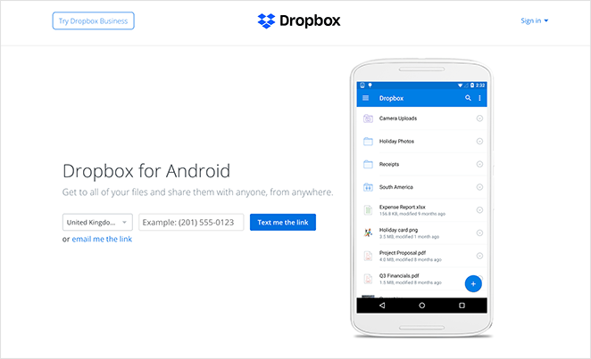
If you want people to use your product, the best solution is to make getting it as easy as possible. That’s what Dropbox did with their Dropbox for Android app landing page.
Geared towards Android users, the page is easy to use and straight-to-the-point. This leaves little confusion over what it’s for, leading to highly-targeted leads.
Why This Landing Page Example Works
- Description – The headline and description has no unnecessary information, including only what users need to get started.
- Image – A preview of the app is shown, giving users an idea of how it’ll look on their device.
- Form – It’s super-easy to get the app. Just enter your phone number, and they’ll text you the link. No other steps are required.
12. Smash Balloon – Black Friday Landing Page Example
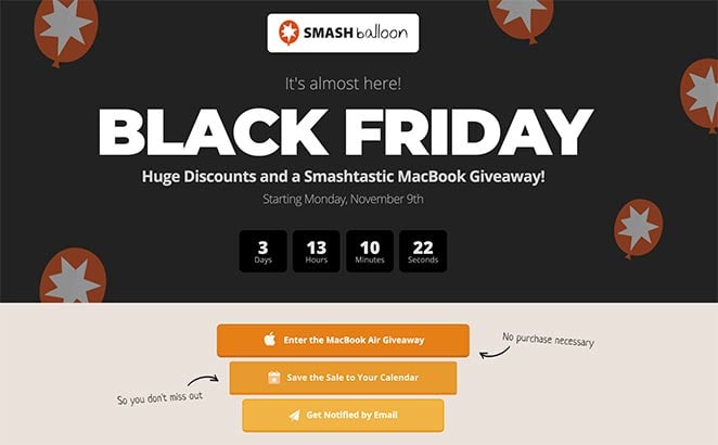
Black Friday is a huge event on any business’s calendar, so preparing a black Friday landing page is a great way to capture all that targeted traffic in one place.
This is what Smash Balloon has done for its Black Friday promotion. The page is eye-catching and offers many ways to engage with the brand over the promotional period, drawing attention to their product discounts.
Why This Landing Page Example Works
- Branding – The landing page design is clearly branded, reassuring visitors they’re a legit business.
- Countdown timer – Using a countdown timer creates a sense of urgency, prompting users to act before the time runs out.
- Giveaway – Including a giveaway on your landing page helps increase the awareness of the promotion. As more people click to enter, more people will see the deal, making them more likely to take advantage of it.
- Reminders – By inviting users to get email notifications and to add the deal to their calendars, SmashBalloon increases the chances of people coming back when the deal is live.
13. Dreamforce – Event Registration Landing Page
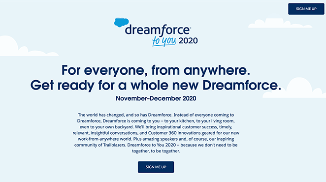
With many live events getting canceled, it’s important that any company whose business thrives off in-person events takes steps to move the experience online. Otherwise, they could lose out on vital business.
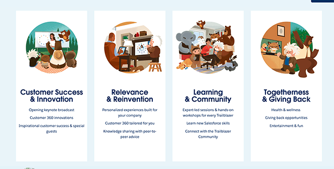
Dreamforce is an excellent example. Instead of the regular annual four-day event, they’re hosting it online so that everyone can attend, wherever they are in the world. Plus, the event registration page offers a stunning example of landing page design that promotes the event effectively.
Why This Landing Page Example Works
- Inspiring Imagery – The images used on the landing page reinforce how an online event can be just as fun and informative as in-person events. The inclusion of a full-width gif towards the bottom of the page makes everything fun and light-hearted.
- Key Information – 4 different page blocks explain what you’ll gain from attending the event, helping you make an informed decision.
- CTA – Multiple CTA buttons in contrasting colors shows you exactly where to sign up.
14. Digital Marketer – Training Landing Page Example
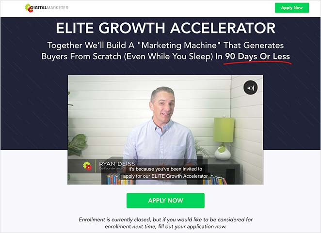
As mentioned earlier, landing pages that include videos are a fantastic way to explain complicated information straightforwardly.
Digital Marketer uses this strategy on its Elite Growth Accelerator landing page. It begins with a video from the Founder and CEO then walks you through the steps of how it works.
Each section of the page is like another step in the decision-making process, holding your hand until you make the final decision to sign up.
Why This Landing Page Example Works
- Video – The introduction video quickly condenses all the information, so it’s easy to understand.
- Step-by-Step – Step by step instructions, guide you through how the coaching works.
- Clever Copy – Instead of listing features, the copy focuses on the benefits. It also tells you what the training isn’t, discarding any fears that prevent you from signing up.
- Bonuses – Instead of only training, you’ll get a ton of perks, making it more worthwhile.
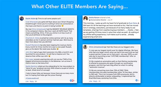
- Social Proof – Screenshots of testimonials from other members give the page authenticity, making it more likely you’ll participate.
- Discount – The slashed price tag reaffirms that this is a fantastic deal that saves money.
15. Taboola – Free Ebook Landing Page
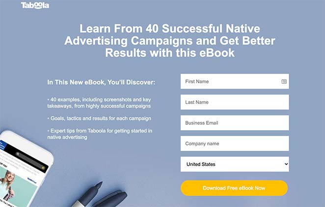
Offering a free ebook in return for contact detail is a popular way to generate leads. Taboola uses this approach for its case study ebook, which is targeted at advertisers.
It’s a straightforward landing page example that clearly shows the benefits you’ll get from reading the book. And because the book content ties in with the brands’ industry, users will be more likely to check them out and grow their email list.
Why This Landing Page Example Works
- Numbers – Using numbers in your headlines makes your copy my credible and persuasive.
- Bullet list – Bullet lists make the content easy to skim read quickly.
- Form – The signup form is short and only includes the necessary form fields.
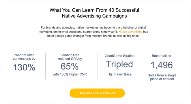
- Proof – Taboola includes statistics of how brands increased conversions with native advertising, which is the ebook’s main topic. This gives the book credibility and makes people want to learn how they achieved it.
- CTA – CTA buttons are used at the top, middle, and bottom of the page to remind users to click.
Ready to Build Your Landing Page?
If these landing page examples have given you all the inspiration you need to get started, why not check out our guide on how to create a simple landing page. You won’t need any design or code experience to get started.
If you need a bit more inspiration, take a look at these 404 landing page examples and templates.
And if you liked this article, then please follow us on Twitter and Facebook for more useful content to help grow your business.
The post 15 Landing Page Examples PROVEN to Convert appeared first on SeedProd.